A new
era for employment
Head of Creative & Design
As Head of Creative and Design at Employment Hero, I had the privilege to build our in-house creative agency, Hero Collective. Together we led the charge on a bold new brand identity.
My role spanned from brand strategy to creative direction across design identity, photography, tone of voice, video and motion principles, website and social content.
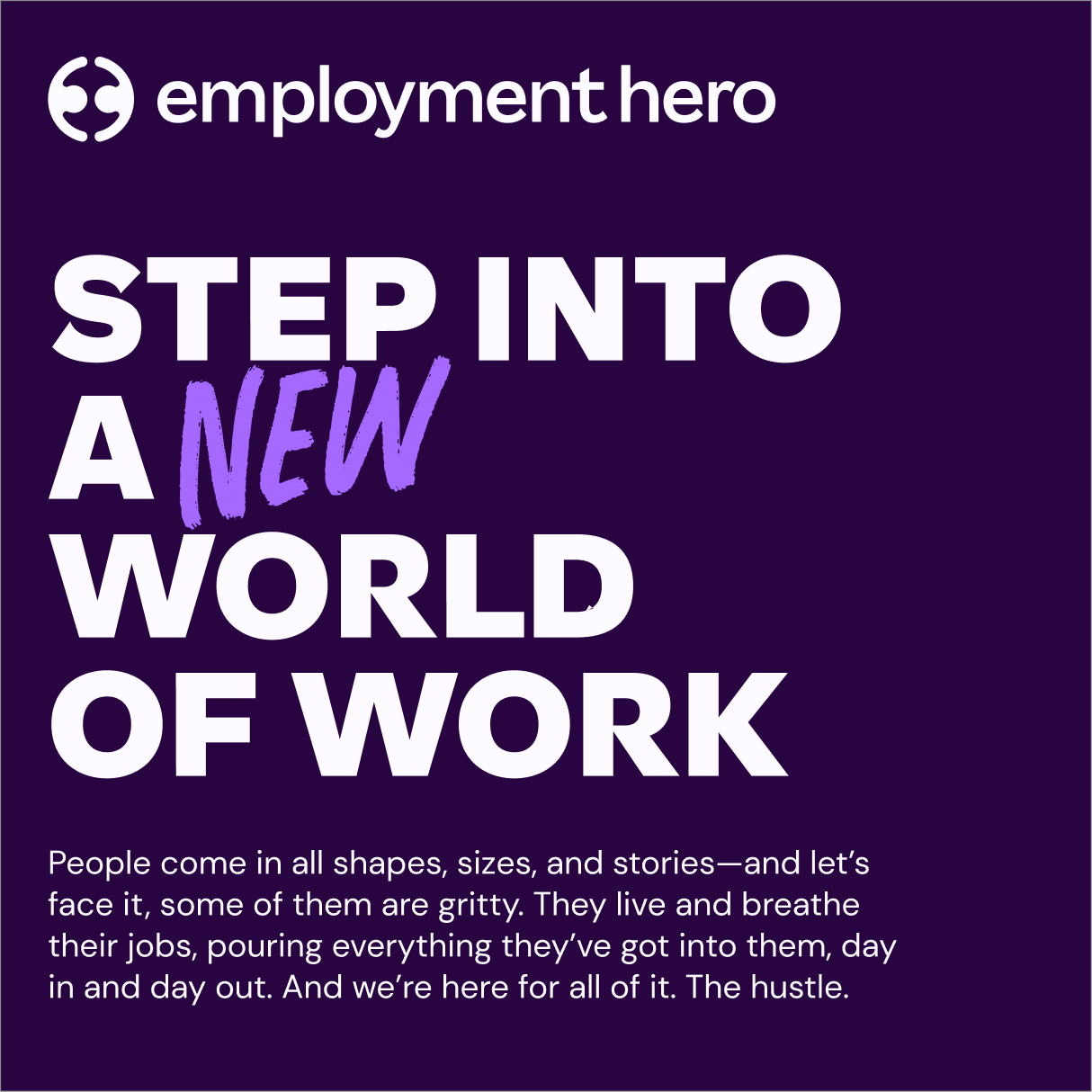
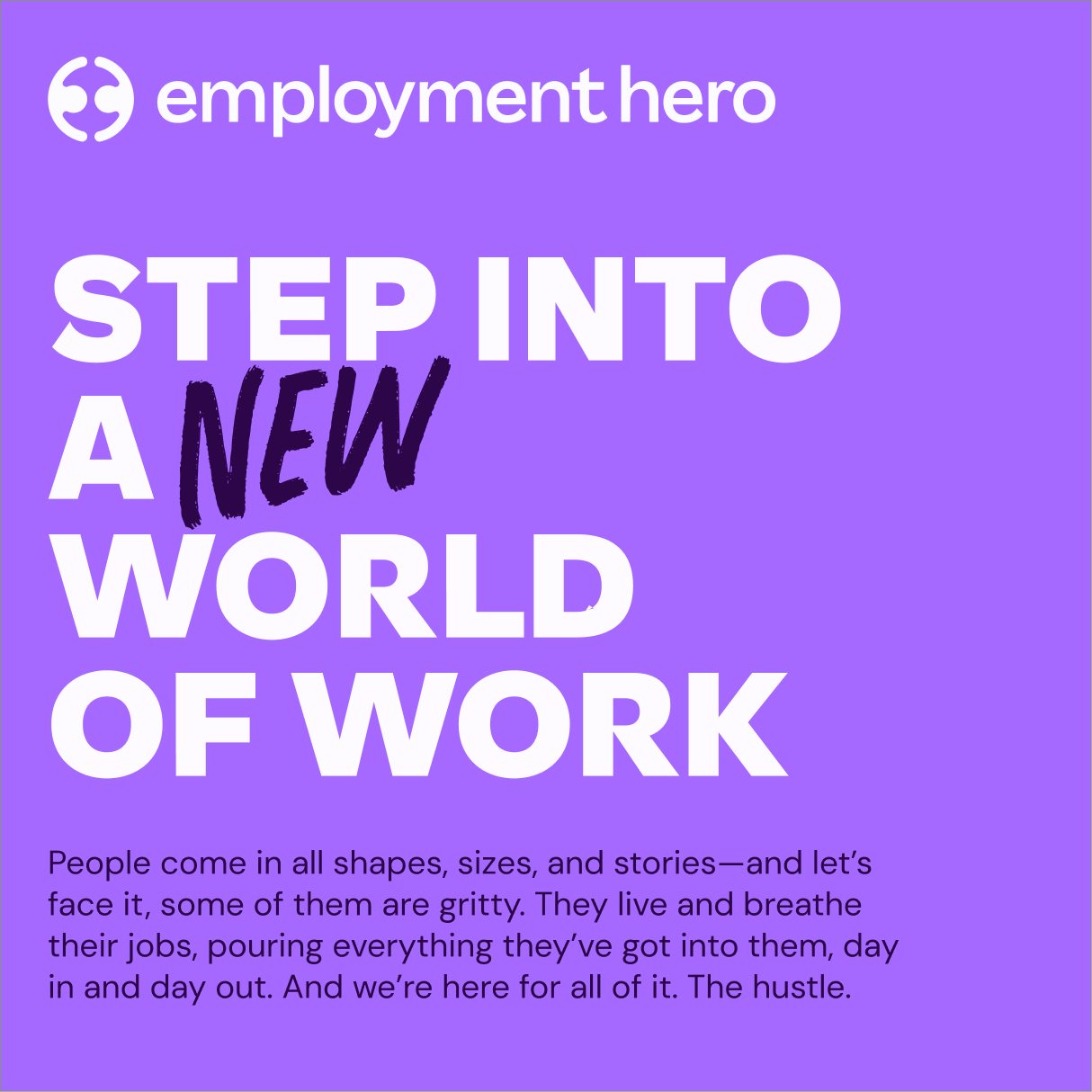
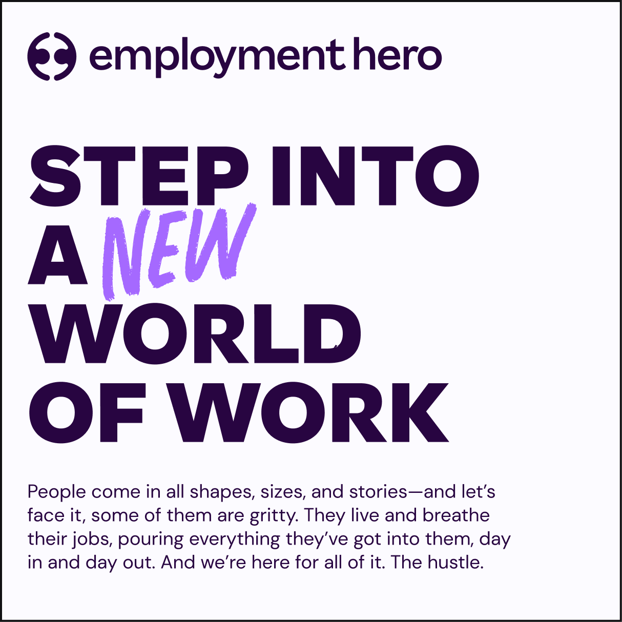
This is a full evolution of how Employment Hero shows up as the global authority in employment—featuring a fully reimagined identity, a bolder tone of voice, and one powerful brand built to stand out.
And we made it all happen in-house.
Brand ID hype reel
The brief
Position Employment Hero as the global authority on Employment. In order to do so, we needed to evolve the brand ID to be bolder, more confident and distinctive.
The old
brand
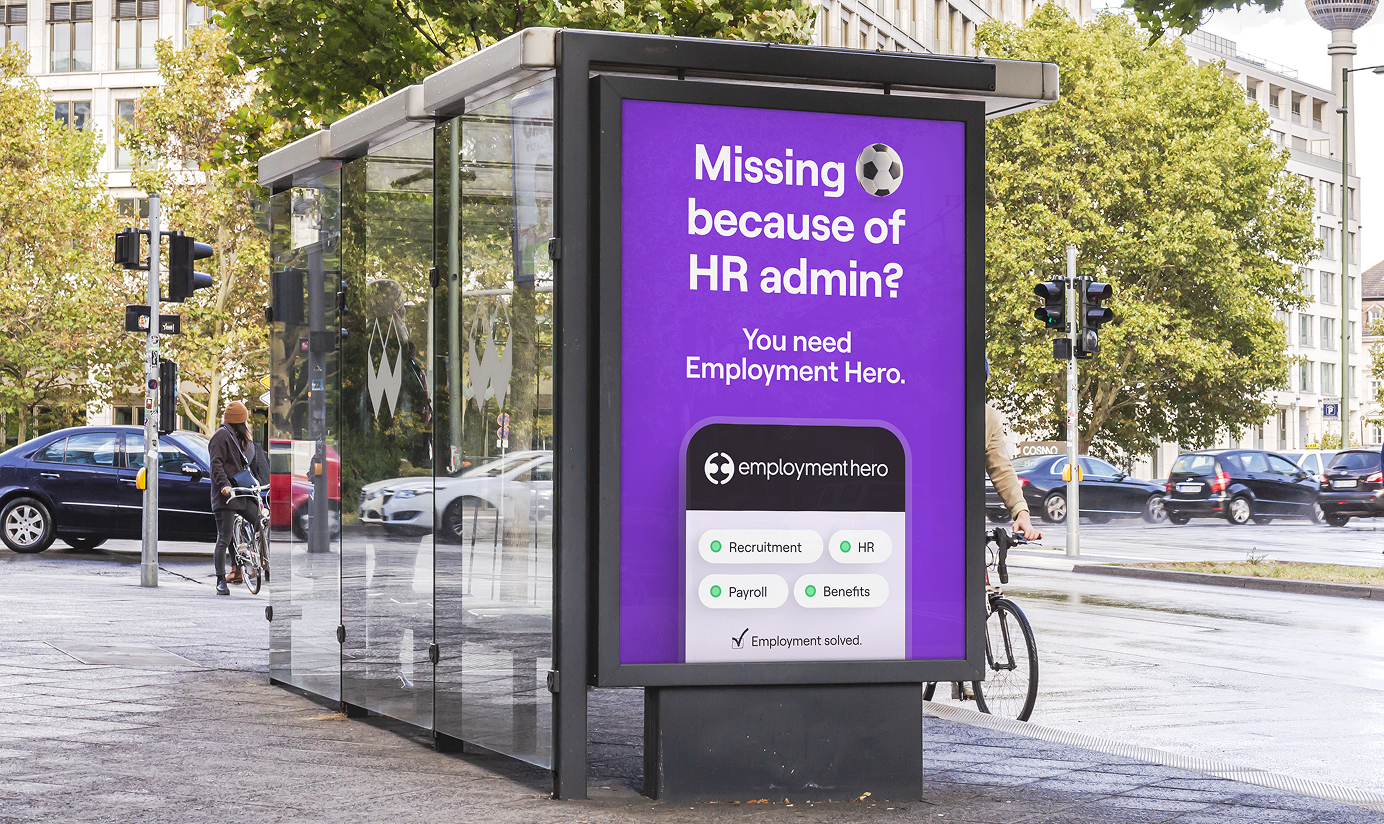
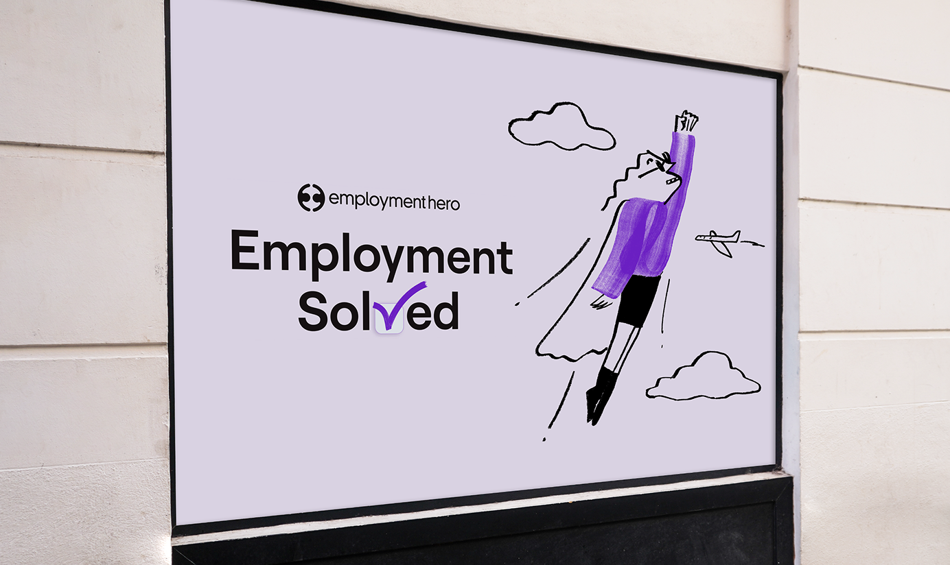
The new
brand
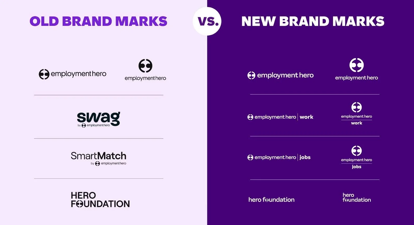
Brand consolidation and strategy
The Employment Hero brand is more than just a logo.
It's a layered system that helps us show up clearly across everything we do. Our brand architecture has five tiers.
The EH logo is a distilled representation of our brand driver, it represents two people coming together as one dynamic force. The characters also suggest the globe and connection possible across it.
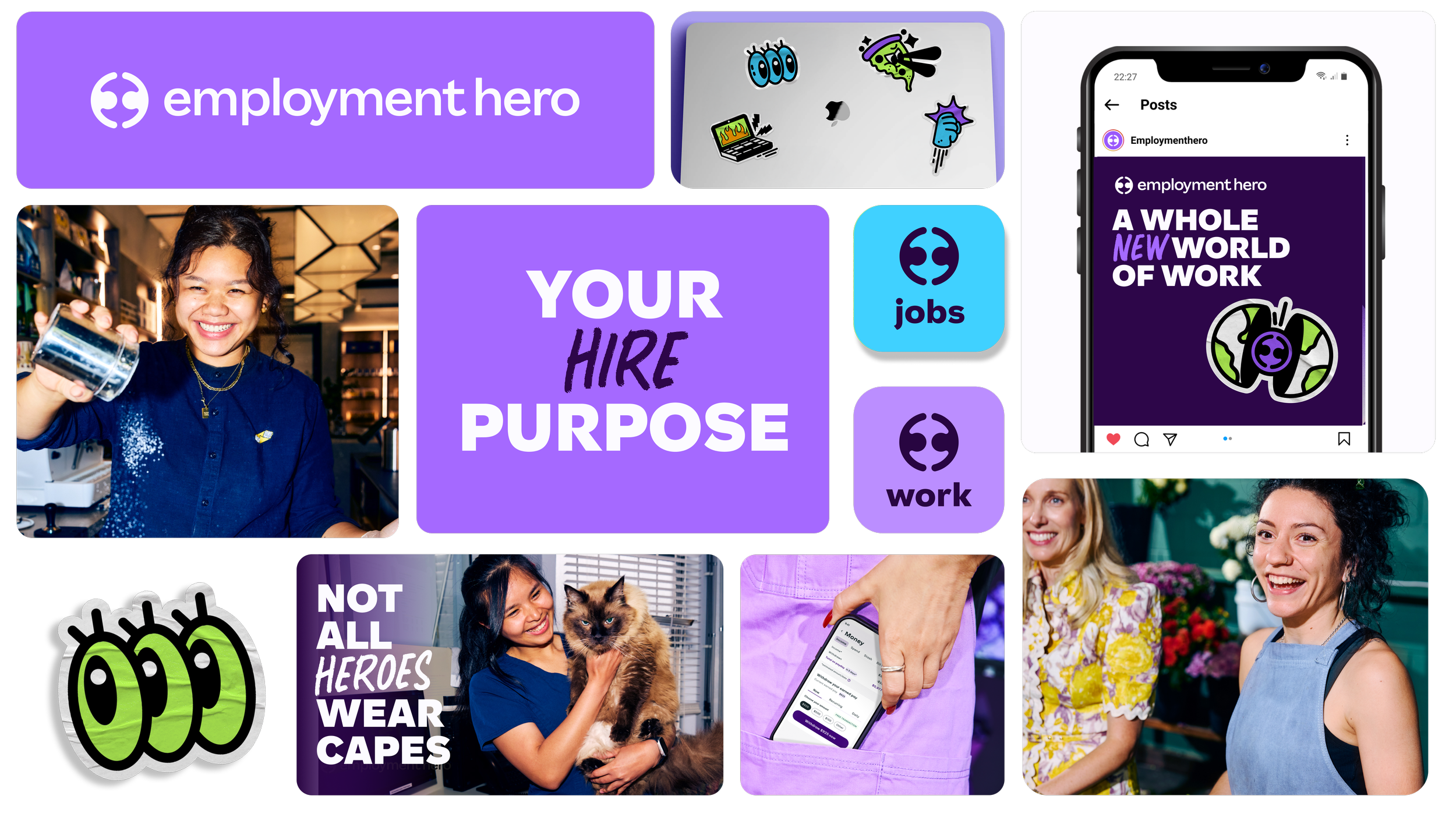
Logos
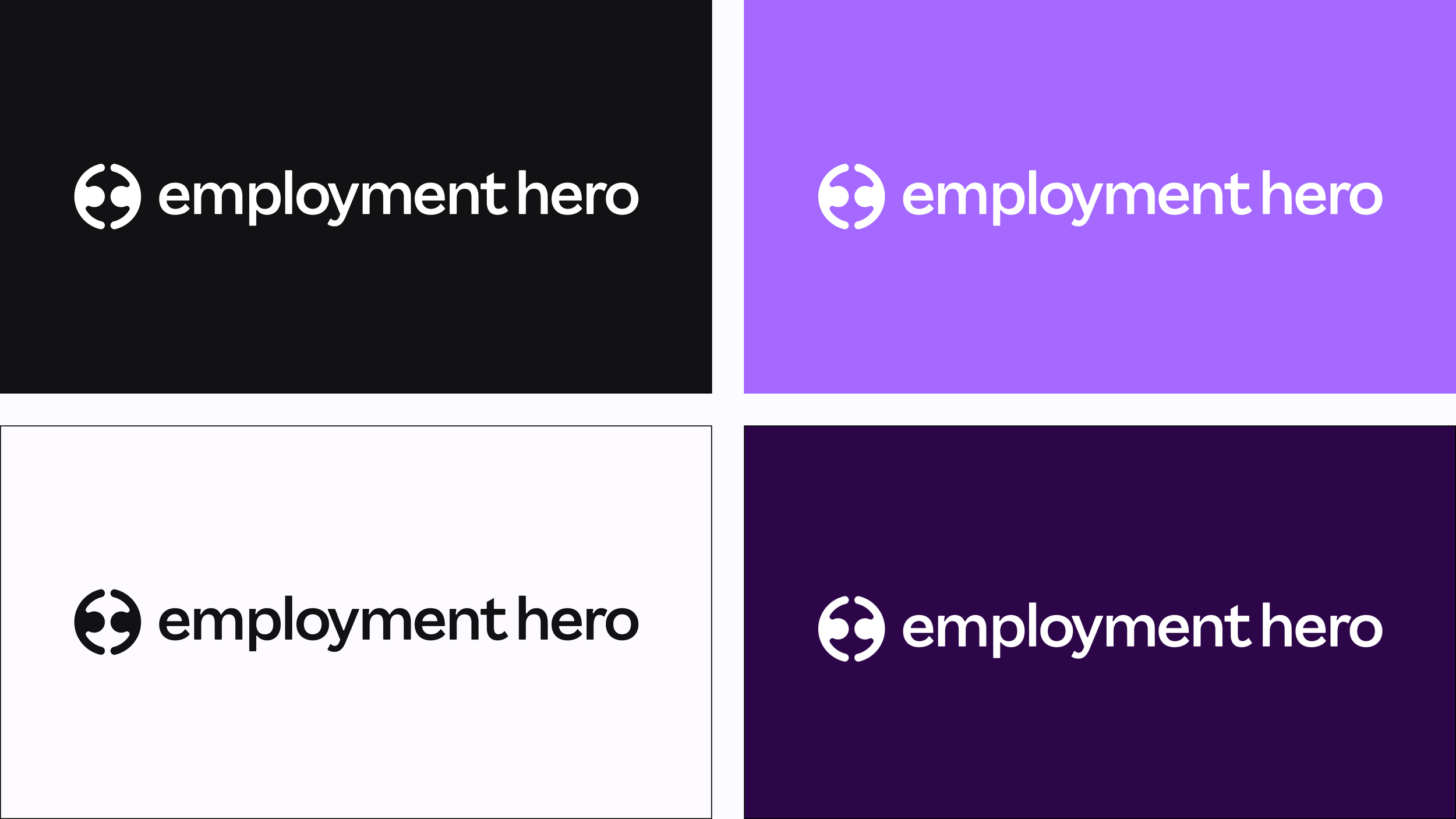
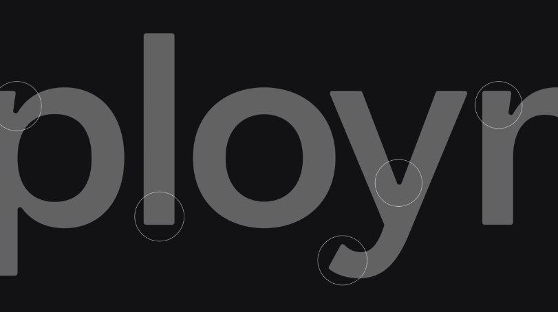
The logo features a custom adaptation of our primary typeface, Saiga, with rounded edges that seamlessly mirror the logo symbol. This refined typography aligns the brand identity with a cohesive, modern look, enhancing visual harmony across all applications.
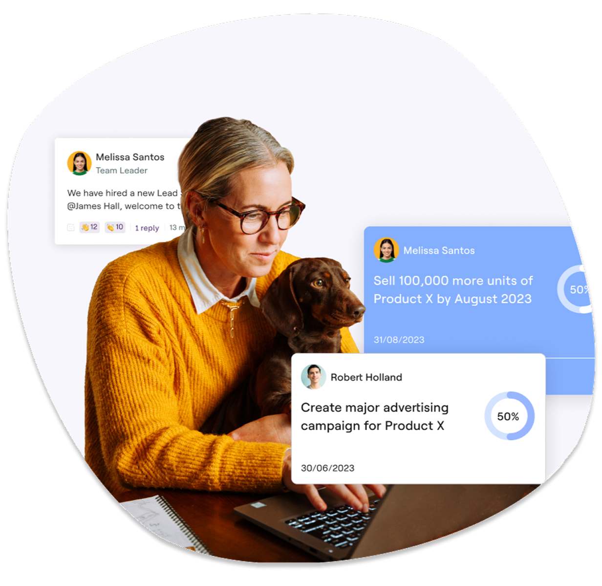
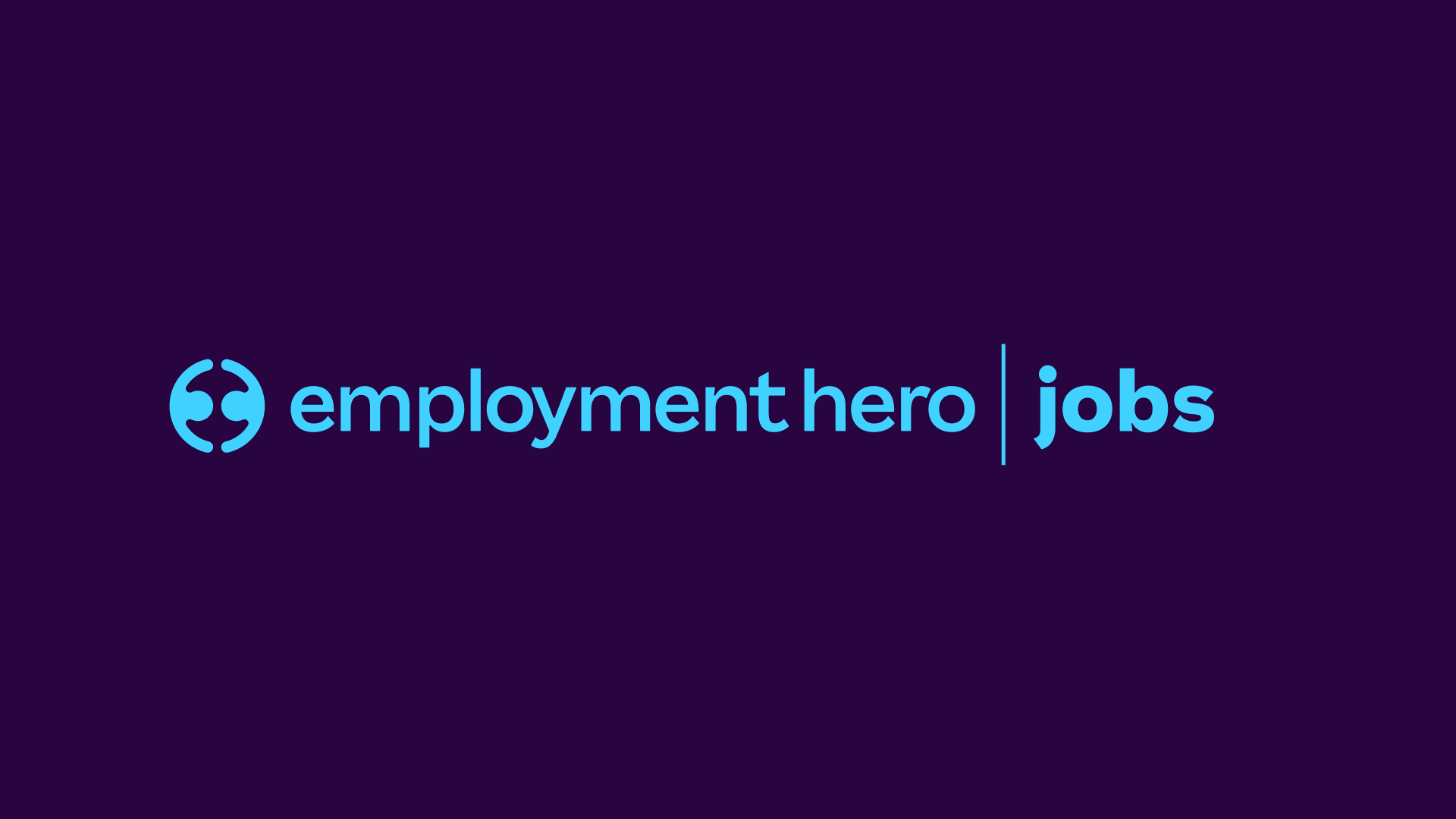
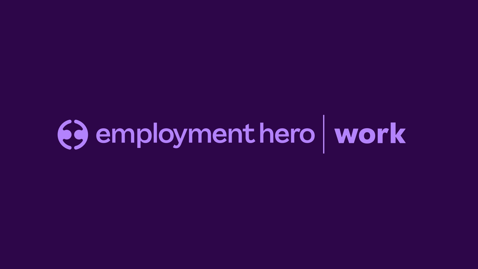
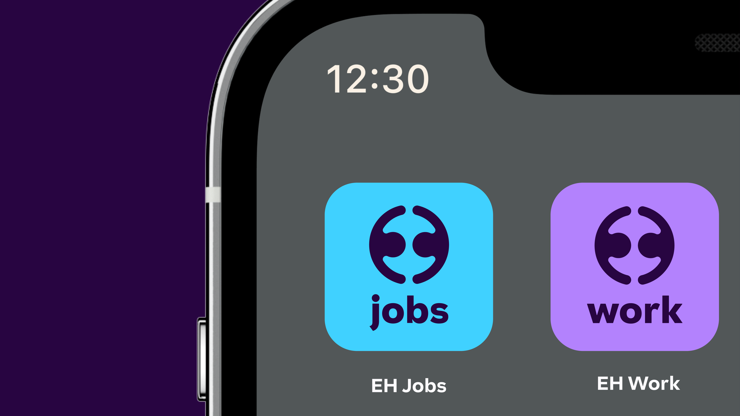
We also launched two new apps, EH Work and EH Jobs, which share the same overarching identity from the masterbrand, but with an accent colour to differentiate them.
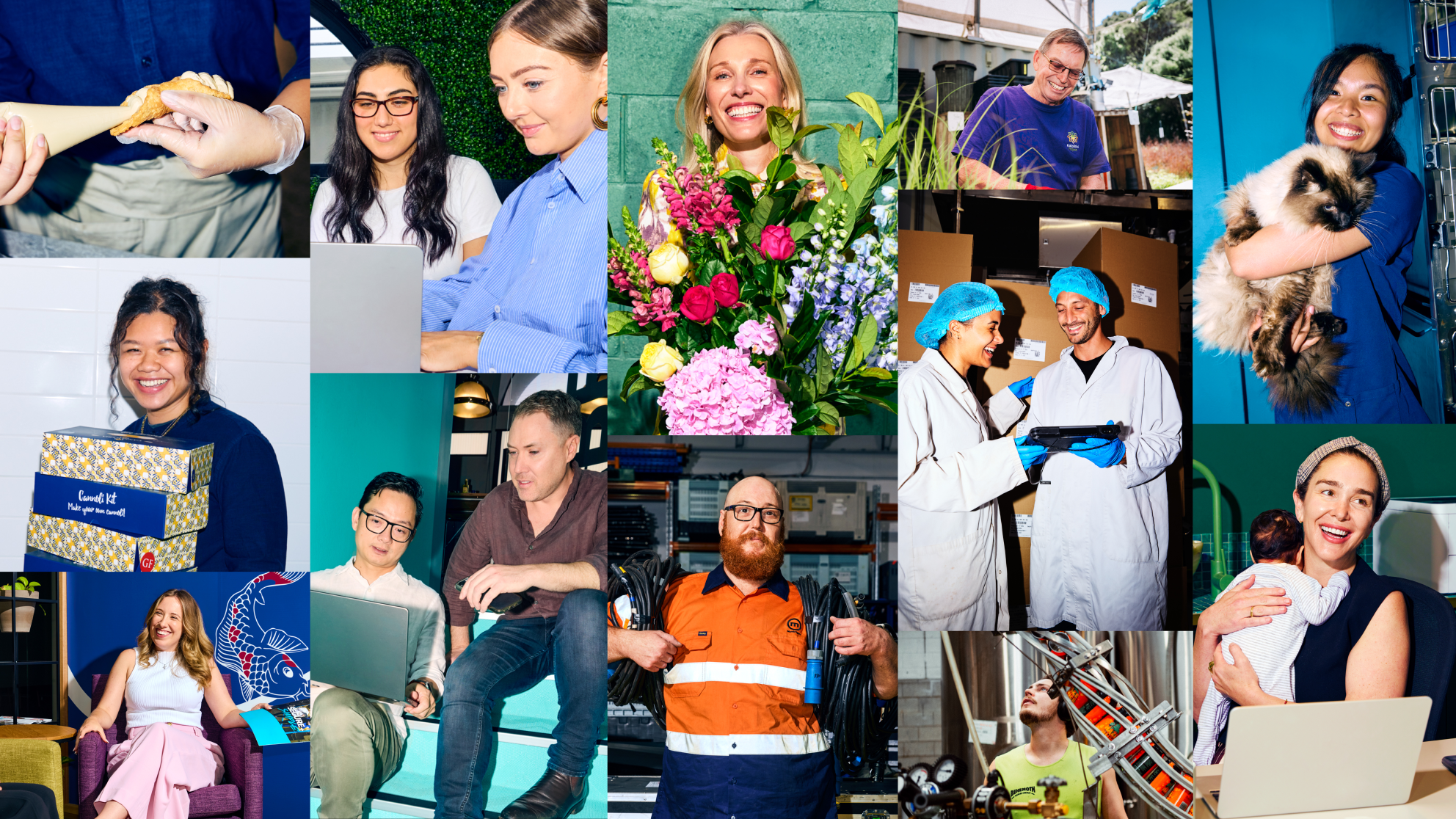
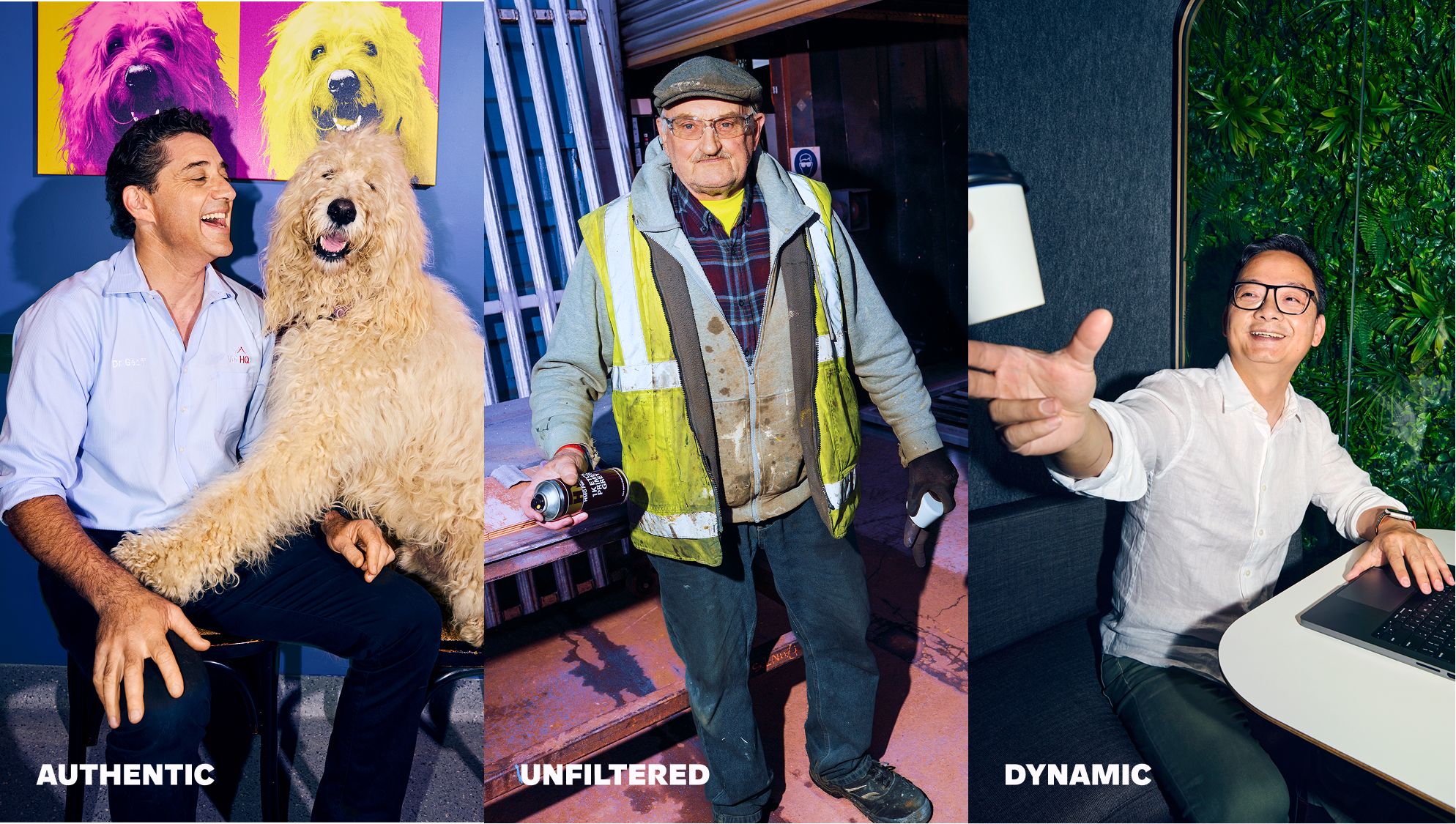
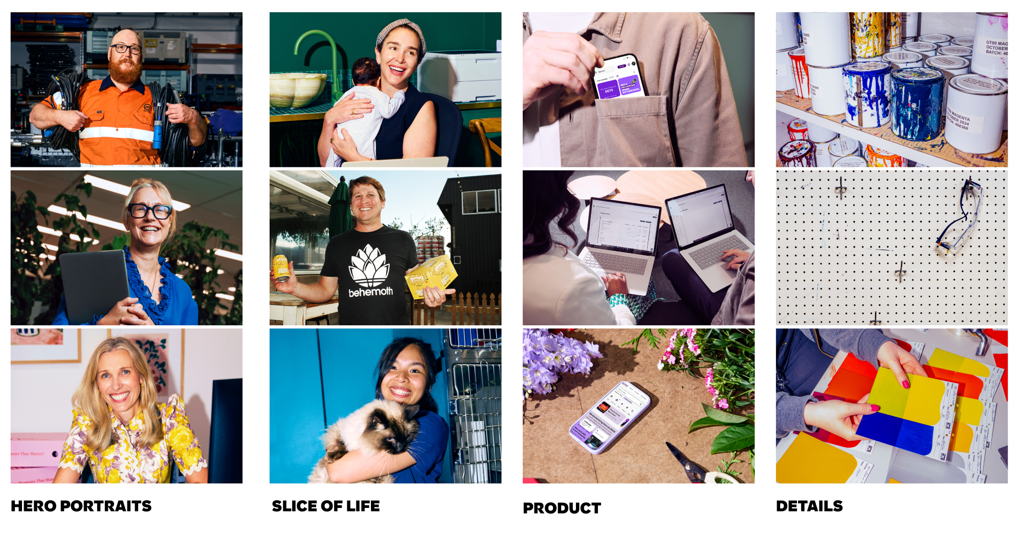
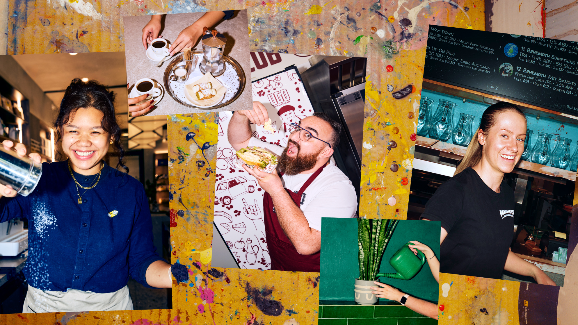
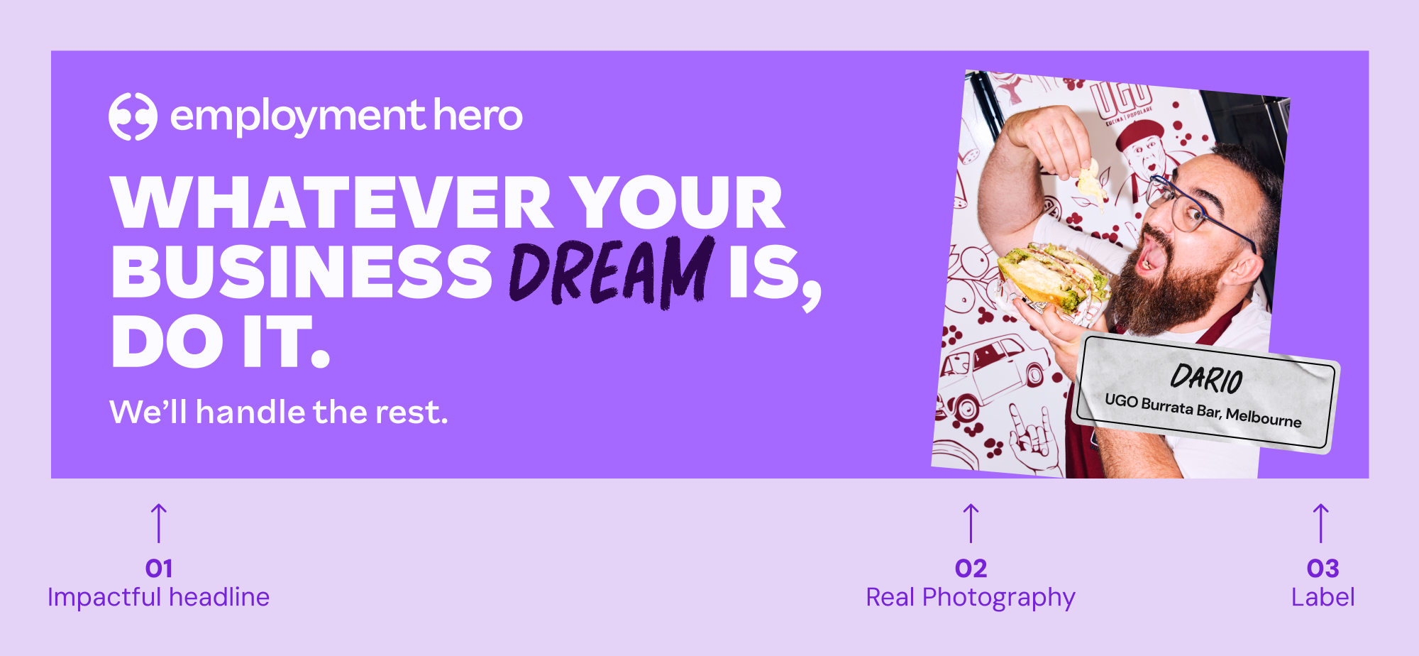
Photography
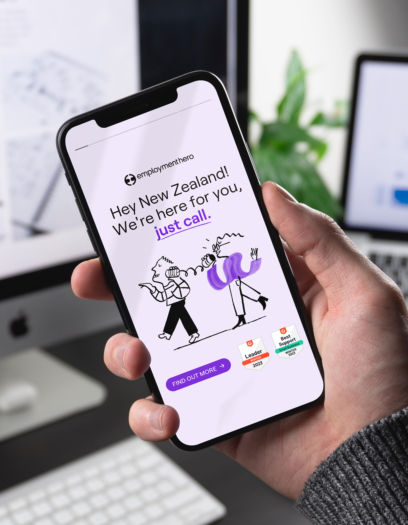
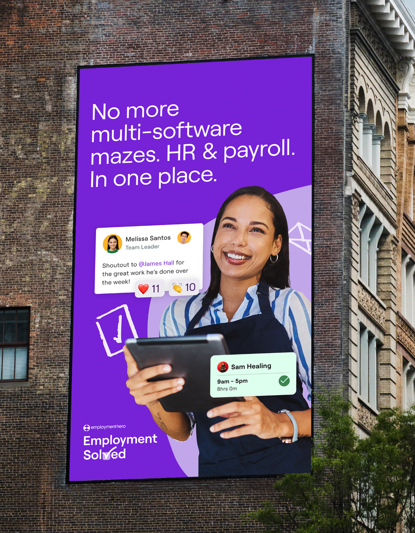
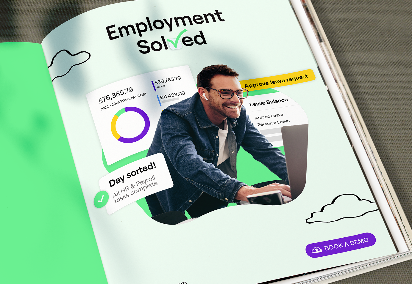
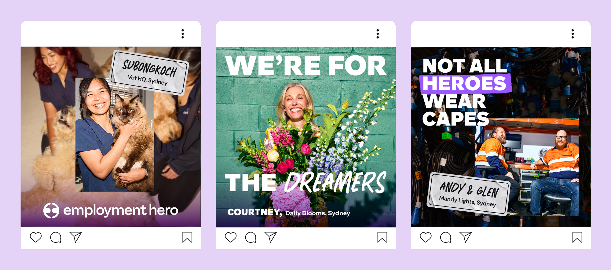
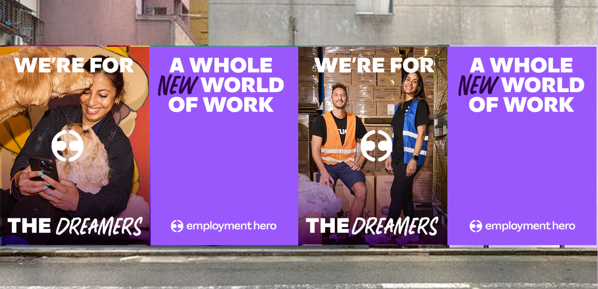
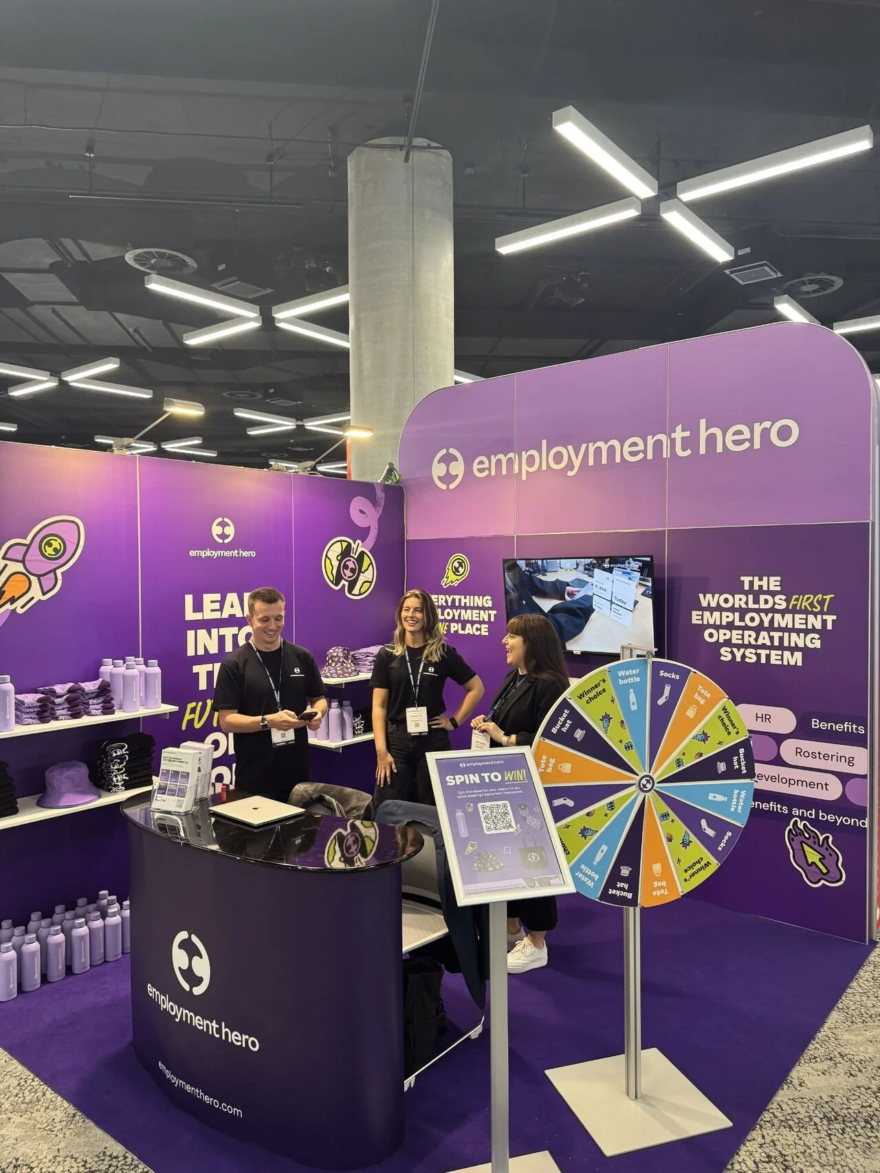
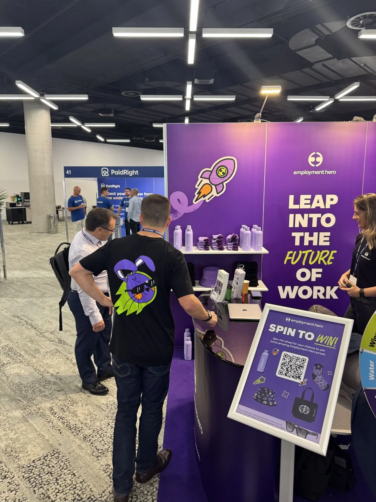
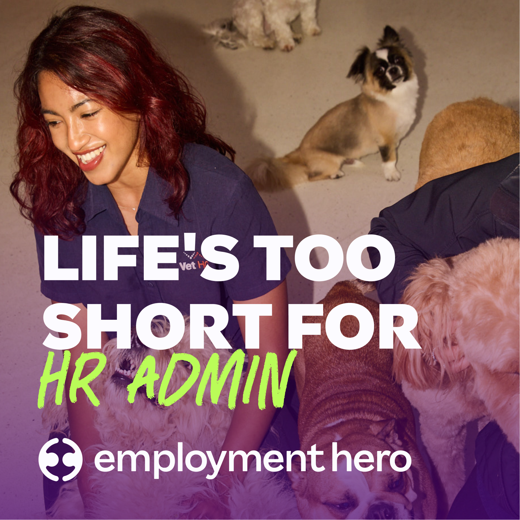
Every photo should feel real: just like us. It’s how we show the people, energy and ambition behind Employment Hero. But we don’t stop at reality. We push our story further, capturing the drive that keeps us moving forward. Together, they show exactly who we are: ambitious, human, unstoppable.
BEHIND THE SCENES
〰️
BEHIND THE SCENES 〰️
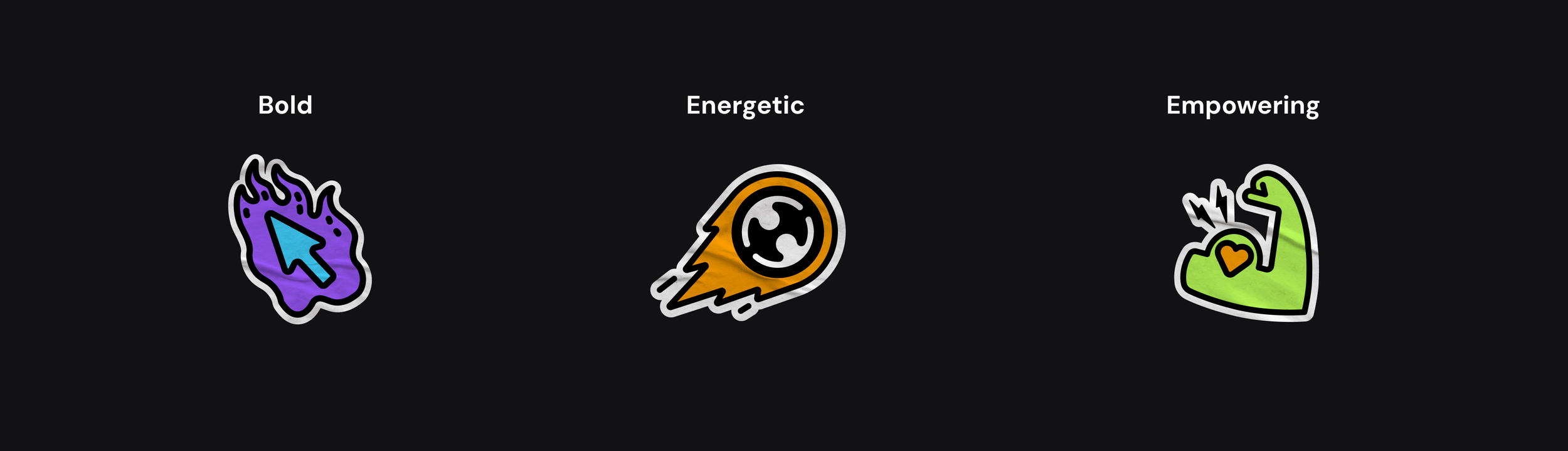
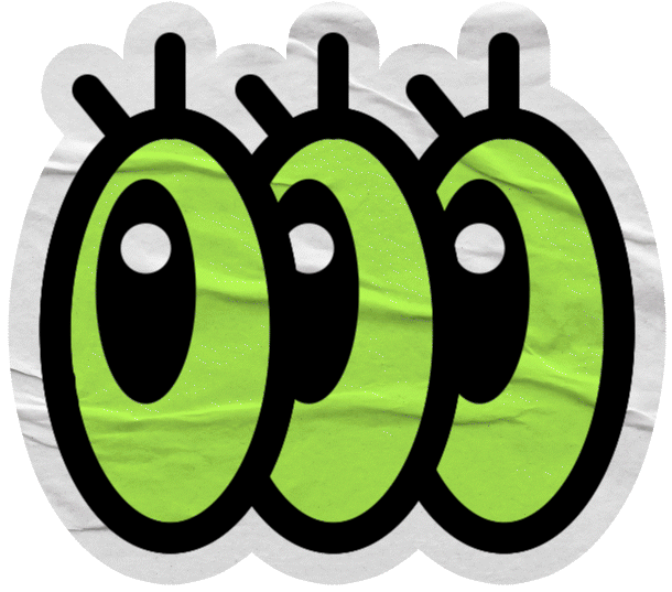
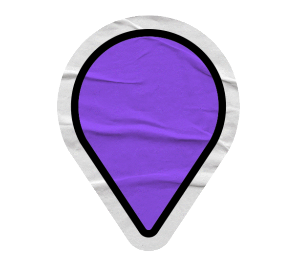
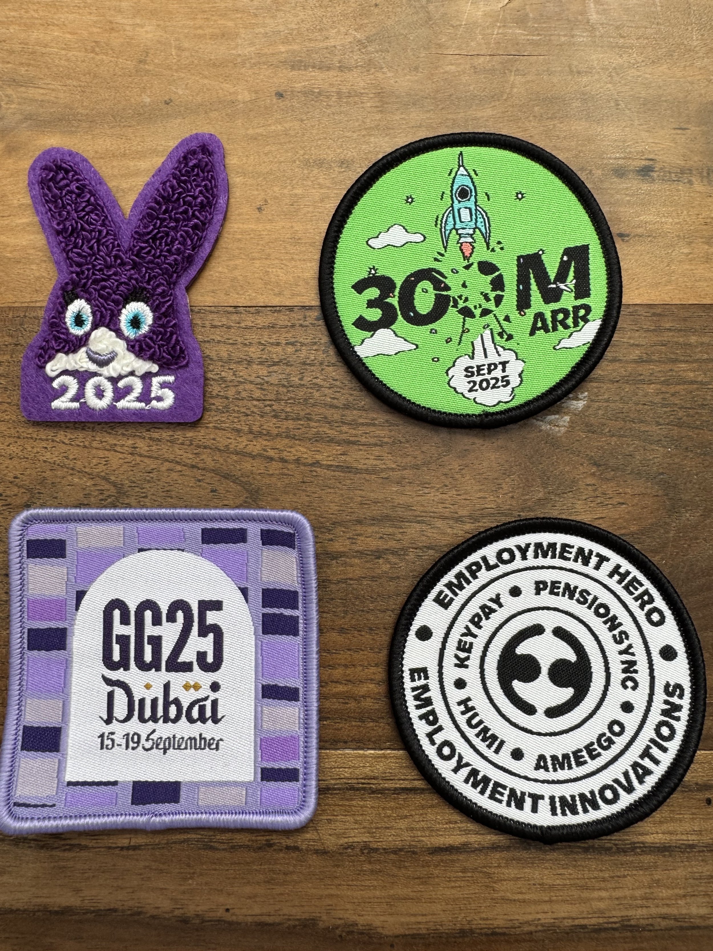
Our stickers are all about sparking joy and excitement. They’re the perfect sidekick to our photography, adding some edginess without stealing the spotlight.

Illustration

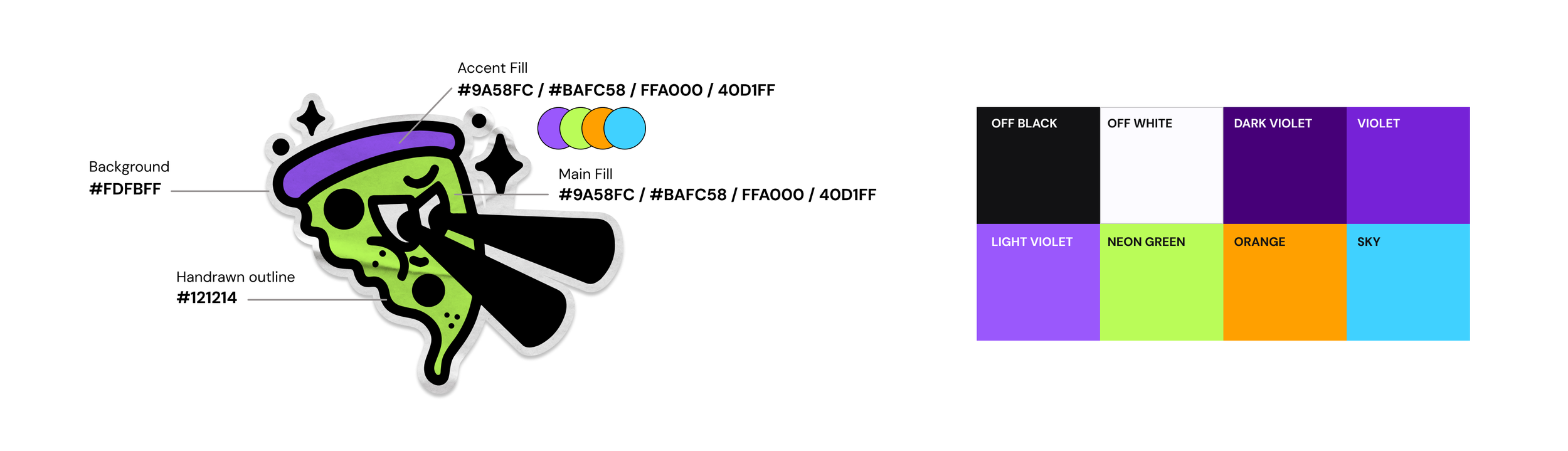


Colour
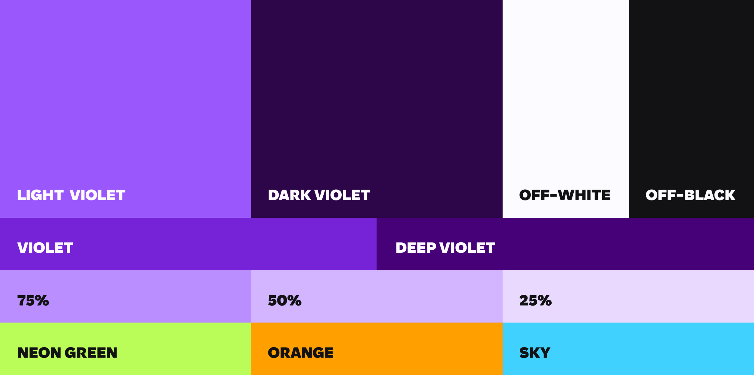
The palette consists of two distinct violets to strengthen our presence across every channel, supported by tints and accent colours to highlight key elements and CTAs.
Typography
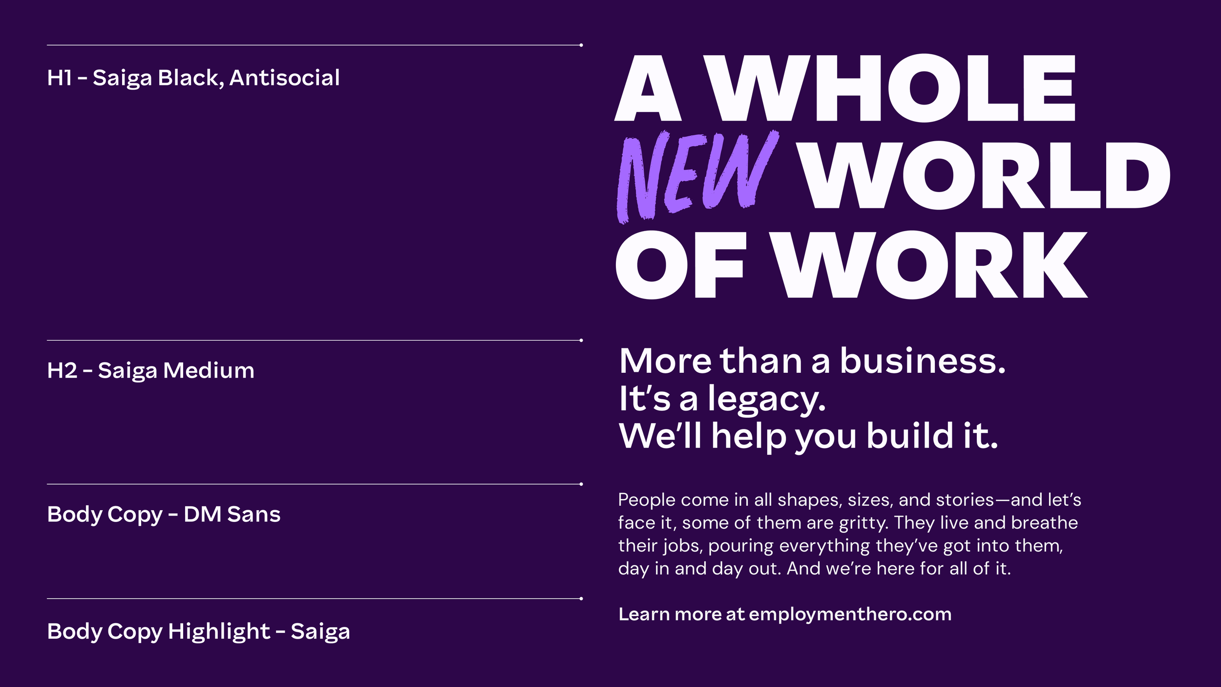
From clean and efficient to vibrant and engaging, our fonts work together to capture the brand's versatility and personality, perfectly complementing Employment Hero's visual identity.

Video and motion
With the Local Stories series we showcase the diverse businesses that use Employment Hero around the globe, narrated in an expressive way which stems from our overarching brand ID.
Audio Identity
We teamed up with Smith & Western to craft a distinct brand sound that reflects our mission to break the status quo while providing real, authentic support to businesses. We worked on multiple logo sonics as well as brand tracks to be used across campaigns and content.
This sound is a cornerstone of our brand identity across multiple touchpoints, so it needs to stand out and feel in tune with our rebellious ethos.